The task:
For my first digital media workshop, I was assigned a task to come up with a digital product which aids in the waste of food and water.
In the UK, we throw away 7m tonnes of food and drink from our homes every year, most of which could have been eaten if only it was managed better.
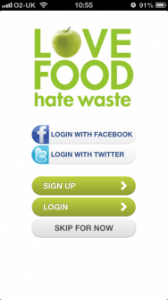
I decided to approach this task by researching different digital products which have already been created such as apps and different devices. I come across a free money saving app called “Love Food Hate Waste” which allows you to track your shopping and create interesting meals for leftovers you may want to throw away.
 The problem i have with this idea is that either the different sorts of food being wasted don’t go well together or the consumer doesn’t particularly like the taste of the food or drink and purchased it to see how it tasted, This results in meals not always being made, therefore it being thrown away. I feel like this application could implement a rating and comment system to different types of foods and drinks the user is thinking about trying for the first time with a list of other foods which has similar traits to it such has texture and taste, this will allow the user to make a more comfortable decision saving them money. Another idea for this is to help others who are less fortunate such as giving charities unwanted foods like tin cans which haven’t being touched in months or other foods that are reaching their expiry dates, the user would be able to add foods to a list and fill in a few simple contact details such as address and phone number and the unwanted food will be picked up.
Another unrealistic idea is to give the user a free sample of the food they’re looking to buy. For example perfume catalogues allow you to smell/sample their products by smell, maybe it’s possible to send taste samples to users of this application, Most likely unrealistic.
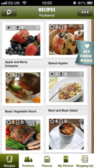 I decided to download this application, analyse the design and play around with some of the features, in my opinion it seems more of a cookbook and the interface is confusing to work around. I feel like a more simple design approach would be necessary for first time users instead of bombarding the user with meal combinations straight after login and a slight colour scheme change from the dull(ish) dark green to a bright and positive green. On the other hand I like the look of the logo design with the use of a fruit to promote healthy eating.
I decided to come up with my own name for an app and decided to call it “Efficient Eating”, I feel like this name is most appropriate in terms of tackling the food waste issue. I wanted to give a simplistic design to the logo of the app, This is my initial design for the app.
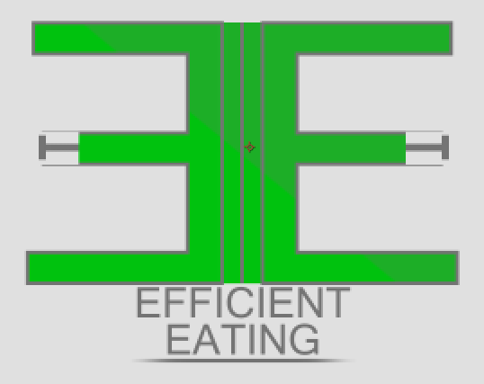
I decided to not carry on with this logo due to the feedback from my digital media tutor, He told me that it looked like a logo to do with trains and there was unnecessary additions to the font like the tracks on the middle of the E’s. He also told me that the logo was quite bright and if it was incorporated into an application then it would be extremely hard to see. I took all of his feedback onboard and decided to quickly come up with a new logo.
This is what i come up with.
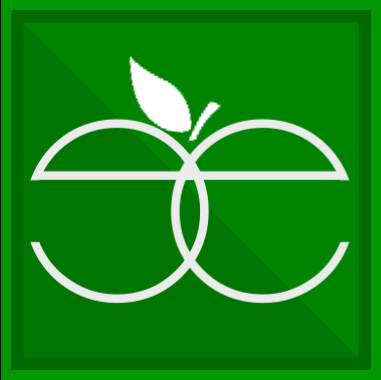 I got inspiration from the adobe logos from their creative cloud, I liked the border idea. I wanted to change the font from a blocky font to a more rounded font. Like the love food hate waste app with the apple. I wanted to implement some type of food but make the food out of the letters. I tried making an apple which i’m pretty pleased about.
Designing of the app screen: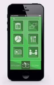
For this screen design i downloaded a iPhone 5 template and added my design on the screen, I thought i’d go for a more simplistic approach for the more older viewers which aren’t used to this sort of technology. I stuck with the same colour scheme but i changed it slightly, To a more desaturated look. I felt that the logo colour scheme looked a bit too bright and seemed like it would be some sort of army application.